




A brand is the sum of all associations that are made with a product or organization. Our logo is the simplest visual expression of the brand.
Statement from Raudel Bañuelos, Chumash Cultural Advisor: “As a representative of the Barbareño/ Ventureño Band of Mission Indians serving on the President’s Chumash Advisory Council (PCAC) at Cal State Channel Islands, we are pleased to support the University’s new primary logo, which prominently includes sathwiwa as one of the campus’ iconic landmarks along with the Bell Tower. The new logo design with sathwiwa replicates our majestic and sacred Chumash mountain as depicted in photographs, and we are honored to have sathwiwa serve as a beacon of hope not only for the entire campus community, but also for the many communities served by Cal State Channel Islands.”

- Channel Blue serves as the dominant institutional color and should be the most visually prominent color in primary University communications. It is the dominant color in the Primary Logo with Berry Red, a legacy color, appearing only in the two-color logo versions highlighting “Cal State”.
- Islands Teal serves as the primary supporting color and appears with Channel Blue in the Dolphin Spirit Mark. Islands Teal also serves as an accent color and should be used selectively to provide visual variety and support the broader color system.
- White and neutral tones provide clarity, accessibility, flexibility, and consistency across institutional applications. (Harbor Sky, Beach Sand, Santa Rosa Shell, Shale, and Black)
- Silver metallic represents the Dolphin mascot and may be used as an accent when appropriate.
- Primary University communications, publications, website, institutional marketing materials, and core brand applications should be led by the Channel Blue-centered color hierarchy.
LOGO
The Cal State Channel Islands logo represents us at the very highest level. It acts as our signature and stamp of quality. It is, and should always be, the most consistent element in our communications.
WORDMARK
For our wordmark, we typeset our name with natural and handmade characteristics reminiscent of our surrounding environment.
LOGOMARK
Historically grounded in the legacy of our campus location, we honor two significant landmarks as the anchor piece of our logo — the Chumash mountain sathwiwa overlooking the campus and the iconic Bell Tower.
Color Variations
The Cal State Channel Islands logo has four (4) versions that are available in one or two-color options and in different file extensions. For questions, contact Marketing & Communications.
NOTE: Examples shown in preferred order of use for all University production.
ONE-COLOR (1C) POSITIVE
Channel Blue / Black
Preferred versions for all promotional and apparel items.


Use One-Color Positive options and One-Color Reverse White for all promotional and apparel items.
ONE-COLOR (1C) REVERSE
White
Preferred version for all promotional and apparel orders.
TWO-COLOR (2C) POSITIVE
Channel Blue and Berry Red

May be used for digital/CMYK production only; limited use approved for digitally-produced promotional and apparel orders.
TWO-COLOR (2C) POSITIVE, CHANNEL BLUE AND BERRY RED Example Usage: Table Runner (digitally printed) paired with digitally printed table cloth

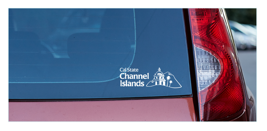
ONE-COLOR (1C) REVERSE, WHITE
Example Usage: Vehicle Decal
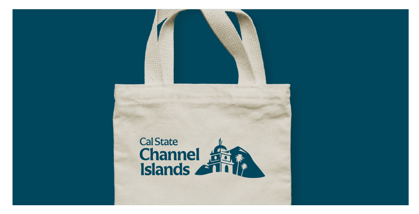
ONE-COLOR (1C) POSITIVE, CHANNEL BLUE
Example Usage: Tote Bag
ONE-COLOR (1C) POSITIVE, BLACK
Example Usage: Standard Copy Paper
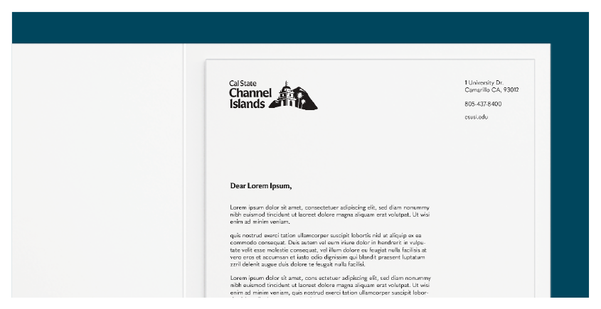
Clear Area/Space
Clear area refers to the safe space required surrounding the logo. The safe area for our logo is measured using the width of the following components. Using this system, the safe area distance will always scale with the logo. This ensures proper breathing room for our logo, wordmark, or seal.
Logo

Wordmark

Logomark

University Logo Extensions
Effective upon the official public launch, all previous branding and non-branded designs created as logos will be archived and should no longer be used by University entities such as areas/units, departments, academic programs, etc., including all campus property, building interior/exterior signage or displays, promotional materials, or marketing giveaways.
Artwork Designs for Marketing Collateral or Apparel
The University plans and executes many forms of communication to the campus community, as well as community partners, and a variation of the Primary Logo should always appear on all marketing collateral or apparel.
Entities may include their approved Logo Extension or create "artwork" to convey an event theme but should never create a "logo" that would replace the Primary Logo or a Logo Extension in overall use.
Other examples of artwork include marketing collateral for campus events such as Orientation, Homecoming, Grad Fest, Admitted Dolphin Day, Dolphin Open House, or Career & Internship Fair, etc., or collateral created by the Art program for art exhibits.
In all examples, a variation of the Primary Logo should be included in the design (e.g. approved Logo Extensions).
NOTE: The respective Vice Presidents or Provost and Vice President for Academic Affairs shall review and approve requests from their respective division for the creation of University Logo Extensions not currently on the approved list, as well as providing needed updates to existing extensions. Approvals will be provided to Marketing & Communications who will create the University Logo Extension and provide the appropriate one- and two-color files to the requesting area.
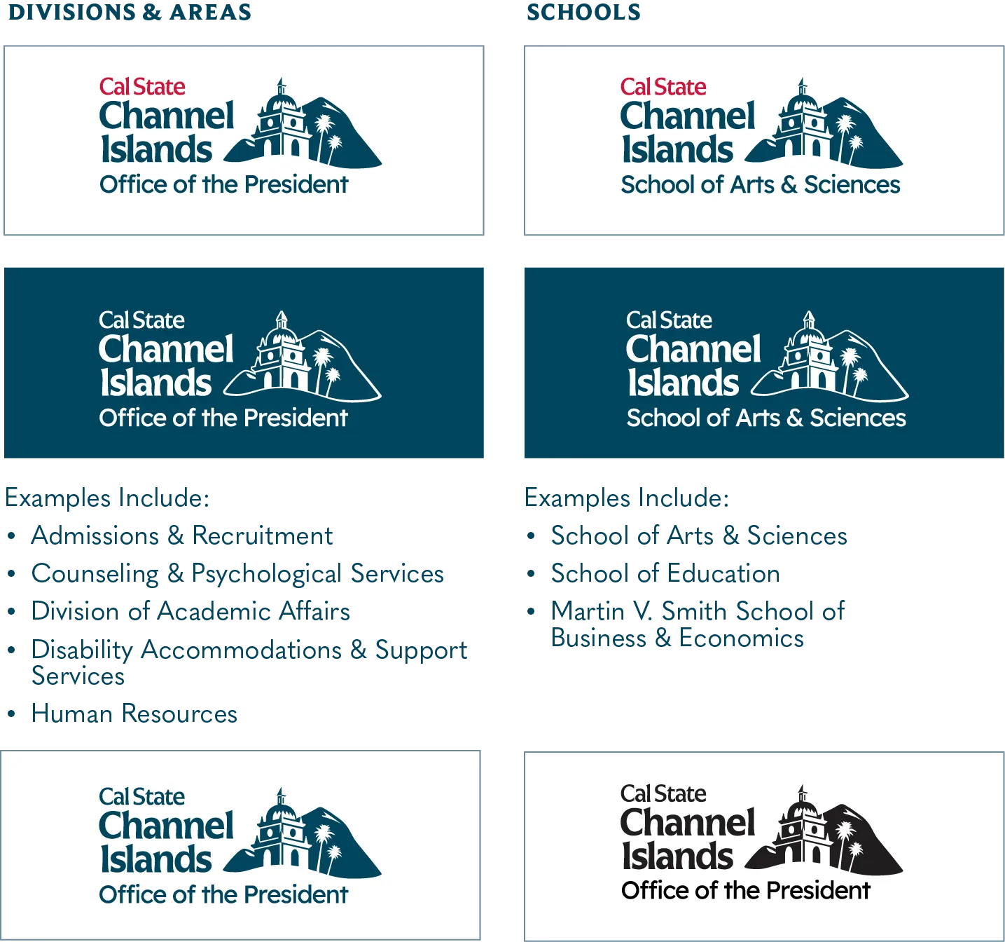
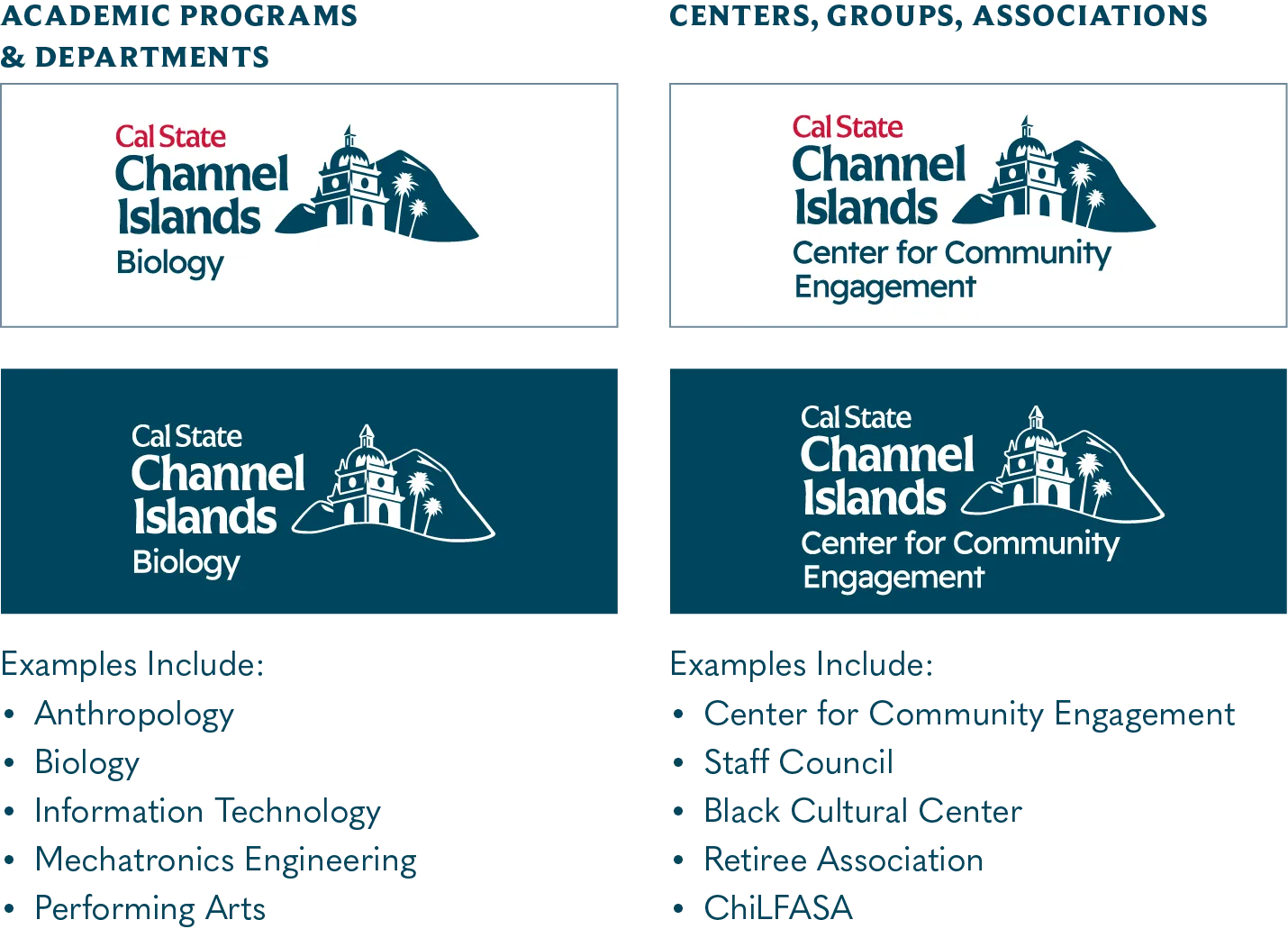
UNIVERSITY LOGO EXTENSIONS (SELECT EXAMPLES)
Logo Extensions may also be used for social media account profile images. Extensions will be provided in Primary and Secondary versions in 2C, Channel Blue, Black and Reverse White formats.
DIVISIONS & AREAS, SCHOOLS
Examples include: Office of the President, School of Arts & Sciences
ACADEMIC PROGRAMS & DEPARTMENTS, CENTERS-GROUPS-ASSOCIATIONS
Examples include: Biology, Center for Community Engagement
Endorsed Logos
These are the only currently approved endorsed logos, which relate to donor agreements or formal partnerships with external entities. The approved endorsed logo, when used in University materials and if our name is not identified as part of the endorsed logo, should always appear in layout along with our primary logo. Marketing & Communications will advise on appropriate use of logos for graphic design purposes. Endorsed logos may only be established with recommendation from the respective divisional Vice President/Provost and approval by the University President.

Sample below shows Endorsed MVS Logo with University Primary 1C reverse white logo.

The University Seal has limited use and can only be used by the President and for presidential events/activities, University approved policies, and for commencement-related marketing materials and recognition events such as ceremonies, diplomas, and Bookstore commencement apparel or gifts. Questions or requests for use of the University Seal may be directed to Marketing & Communications.
 VARIATIONS
| One-Color (1C) Channel Blue | One-Color (1C) Black | One-Color (1C) Silver Metallic (for limited use) | One-Color (1C) Black |
|---|---|---|---|
 |
 |
 |
 |
The Dolphin Spirit Mark is a sub-brand/logo extension. It should not ever be substituted for the University’s Primary Logo in external communications such as student viewbooks, brochures, annual reports, advertisements, social media, etc. No text or marks should appear around the Dolphin Spirit Mark to confuse them as a new mark.
Example use cases include:
- As a Dolphin Spirit Mark Logo Extension for student organizations or clubs including ASI entities. It should not be used to identify academic majors or University departments, areas, or units. Please refer to University Logo Extensions for guidance on usage.
- Intramural sport clubs for use on uniforms and related gear.
- Apparel and retail items available at the campus bookstore or purchased through University vendors.
- On-campus use for environmentals such as banners or signs.
VARIATIONS
| Two-Color (2C) Positive Channel Blue and Islands Teal | Two-Color (2C) Reversed Islands Teal and White | One-Color (1C) Positive Channel Blue |
One-Color (1C) Reversed White |
|---|---|---|---|
 |
 |
 |
 |
NOTE: It is important to follow the Minimum Size dimensions to ensure font sizes are not lower than 6 pt. and for legibility of the name and artwork. If the live area is smaller than the graphic minimum size, please contact Marketing & Communications to discuss alternatives.
|
LOGO VARIATION |
GENERAL APPLICATION |
MINIMUM SIZE |
|---|---|---|
 |
Primary Stacked: This is the version of our logo we use most often. It can work in most instances in print, digital, and environmental applications. |
1.25” wide |
 |
Secondary/Horizontal: This version of our logo should be used more sparingly in instances where our primary logo is too tall. This variation works best for more horizontal usage such as a website header or bumper sticker. |
1.5” wide |
 |
Primary Logomark: Our logomark can be used on its own in applications where our current wordmark or the name of the University appears somewhere else – such as a social media icon, giveaways, or a large-scale graphic element. |
No minimum size |
 |
Primary Wordmark / Stacked: Just like we can use our logomark on its own, we can use our wordmark on its own, too. The wordmark is used more sparingly and is great for very permanent or long-term applications such as campus wayfinding and embroidery. This wordmark is reserved for the University’s primary social media accounts. |
0.55” wide |
 |
Secondary Wordmark / Horizontal: This variation of our wordmark is best used for more horizontal applications. |
1” wide |
 |
Wordmark/Formal: The Wordmark Formal can be used when preparing communication to international audiences. It is also limited for instances such as campus directional signage. Requests for use of the Wordmark Formal are managed by Marketing & Communications. |
1.25” wide |
|
Dolphin Spirit Mark: The Dolphin Spirit Mark is a sub-brand/logo extension for use by members of the campus community for events and examples noted on p. 27. The Dolphin Spirit Mark should never be substituted for the Primary logo on official University external communication, e.g., student recruitment collateral, website, stationery, emails, or other correspondence. |
0.5” wide |
|
University Seal: The University Seal has limited use and can only be used by the President and for presidential events/activities, University approved policies, and for commencement-related marketing materials and recognition events such as ceremonies, diplomas, and Bookstore commencement apparel or gifts. Requests for use of the University Seal are managed by Marketing & Communications. |
3.75” wide |
 |
Acronym Logomark: The Acronym Logomark is for use on items with small/limited live artwork areas, when the Primary Logos would not be legible at a reduced size. It can be used for a social media profile image. Requests for use of the Acronym Logomark are managed by Marketing & Communications. |
1.5” wide |
| Correct Usage | |
|---|---|
|
Do use the approved versions of the logo outlined on page 19. |
| Incorrect Usage | |
 |
Do not attempt to manually recreate the logo. |
 |
Do not lock up promotional slogans with the logo. |
 |
Do not alter the color of the logo. |
 |
Do not apply drop shadows or special effects to the logo. |
 |
Do not tilt or rotate the logo. |
 |
Do not stretch or skew the proportions of the logo in any way. |
 |
Do not rearrange the logomark or wordmark. |
 |
Do not apply the logo directly over busy imagery. |
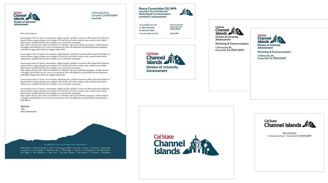
STATIONERY: STANDARD LETTERHEAD, #9 ENVELOPE, BUSINESS CARD, NOTE CARD, MAILING LABEL orders may only be placed with the University’s designated print vendor; other vendors including those offering online services may not be used. (final paper stock and specifications to be determined).
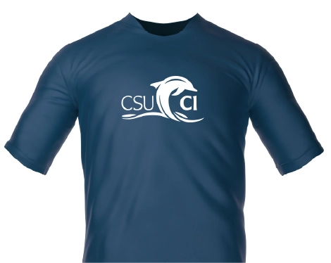
T-SHIRT (Dark background)
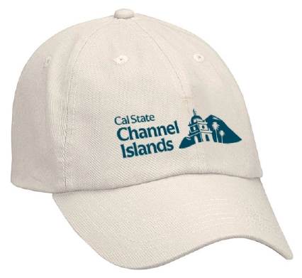
BASEBALL CAP (Light background)
DRINK TUMBLERS (Light background)
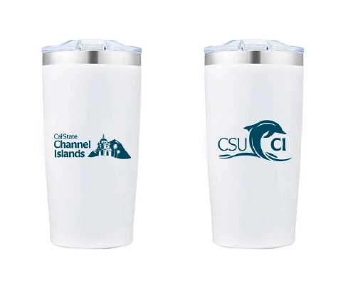
PC: For a larger view, right click on the image and open in a new tab. MAC: For a larger view, hold control and click on the image and open in a new tab.
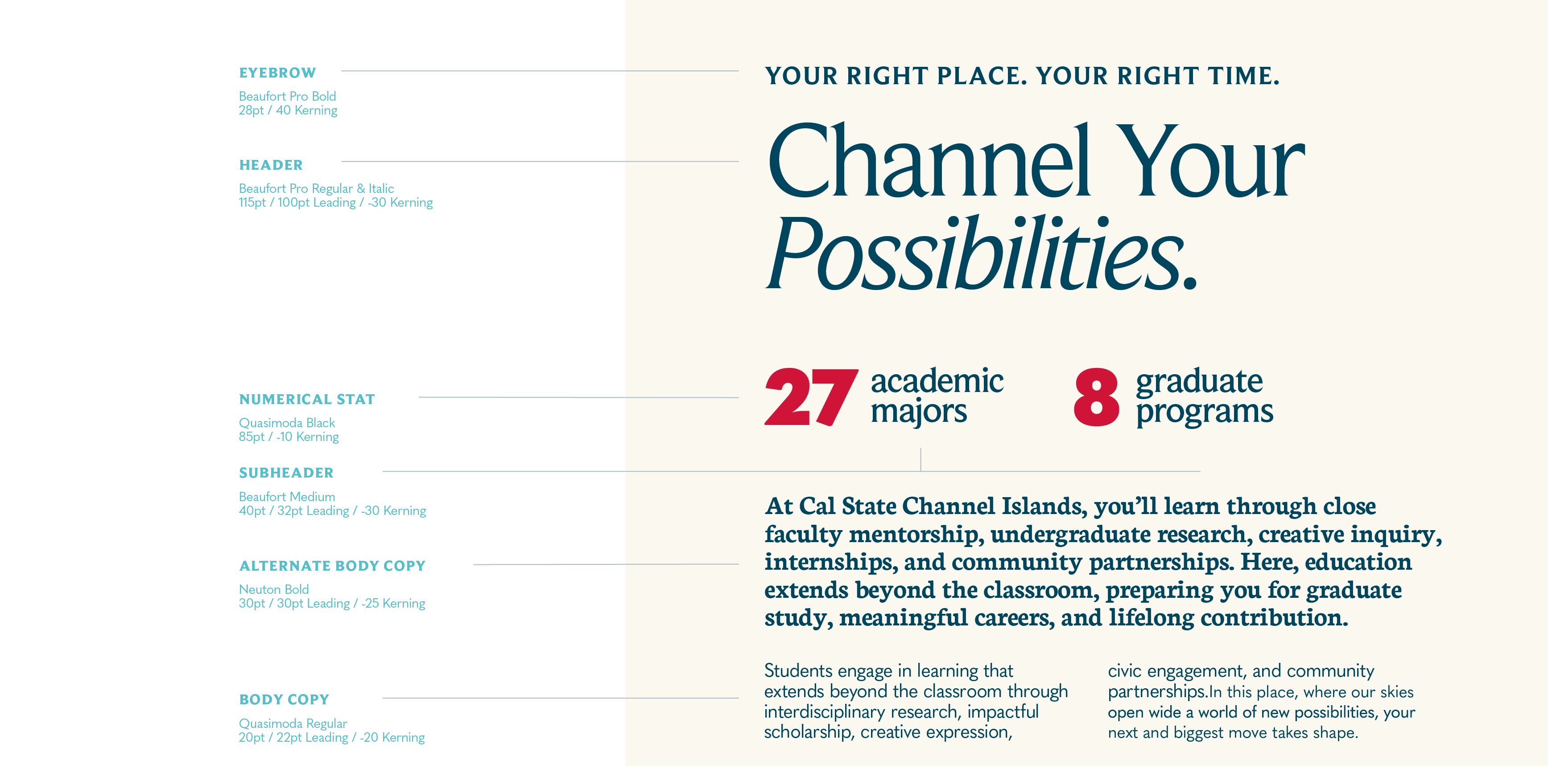
In the typography example above, the typographic elements are set as:
EYEBROW
Beaufort Pro Bold 28pt / 40 Kerning
HEADER
Beaufort Pro Regular & Italic 115pt / 100pt Leading / -30 Kerning
NUMERICAL STAT
Quasimoda Black 85pt / -10 Kerning
SUBHEADER
Beaufort Medium 40pt / 32pt Leading / -30 Kerning
ALTERNATE BODY COPY
Neuton Bold 30pt / 30pt Leading / -25 Kerning
BODY COPY
Quasimoda Regular 20pt / 22pt Leading / -20 Kerning
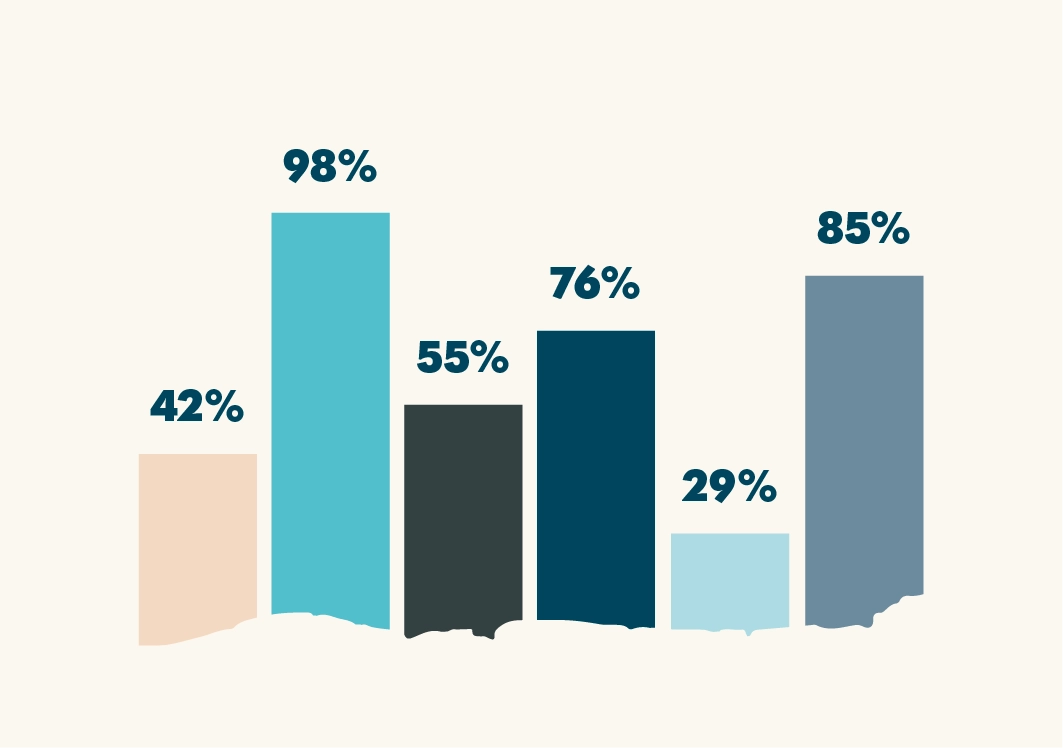
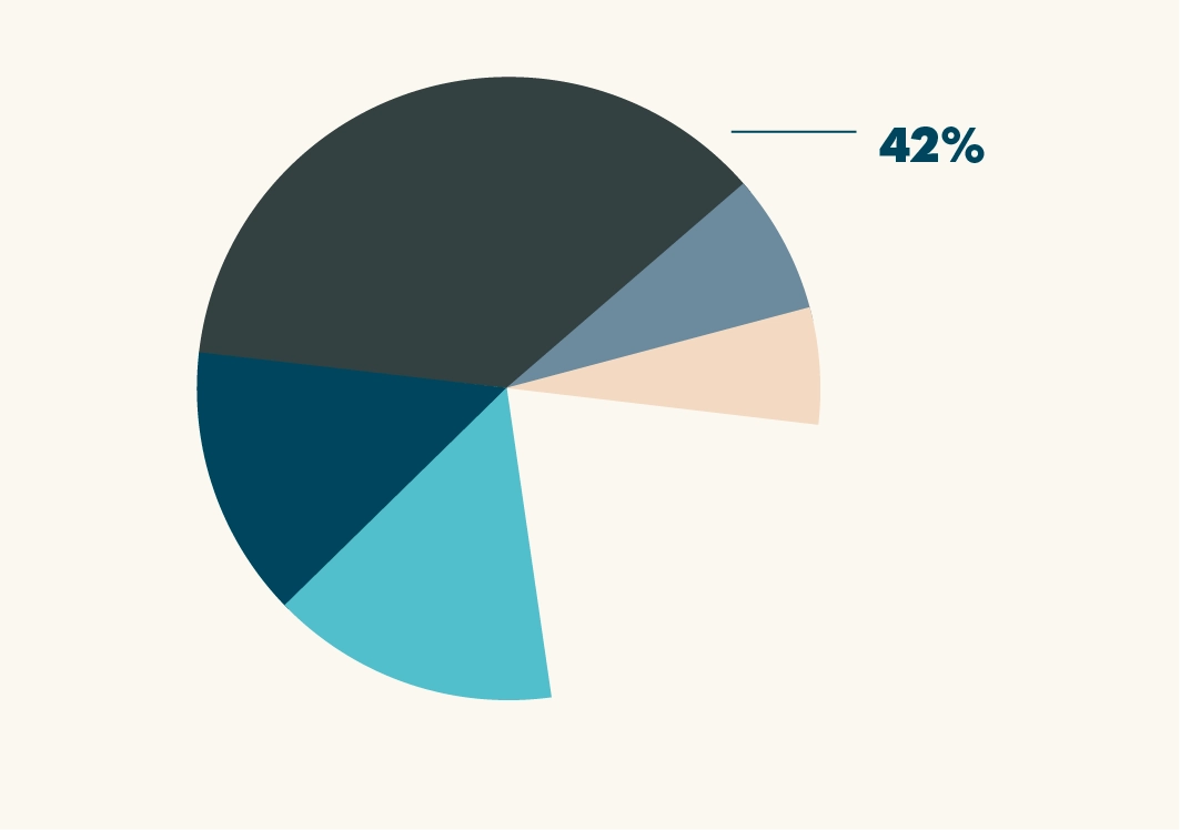
Our design system gives us flexibility and range, as shown here with these extended application examples of our typographic system. There are no hard or fast rules about how we treat callouts and statistics in our visual language, but here are a few treatment examples for reference.
Bar Chart
Pie Chart
VISUAL IDENTITY GUIDANCE OF PRIMARY COLOR PALETTE
| INSTITUTIONAL COLOR |
SUPPORTING COLOR |
NEUTRAL ACCENT |
LEGACY ACCENT |
|---|---|---|---|
| Channel Blue | Islands Teal | White | Berry Red |
|
Channel Blue seen in ocean waters of the nearby Channel Islands. |
Islands Teal seen in fountain waters and landmark features on campus. |
White seen in dramatic cloud formations over nearby mountains and plains. |
Berry Red seen in campus flora and as an agricultural connection to the region. |
NEUTRAL ACCENTS
| Harbor Sky | Beach Sand | Santa Rosa Shell | Shale | Black |
Silver Metallic |
|---|---|---|---|---|---|
|
Refer to vendor metallic samples. Not for print ink use. |
WEIGHTED COLOR USE / VISUAL HIERARCHY
The recommended color percentages serve as a guide for achieving a consistent visual balance across communications. They are not intended to be measured precisely, but rather to help designers establish the overall visual hierarchy of a piece.
Consider the percentages as an estimate of how much visual space each color occupies in the finished design. This includes backgrounds, large graphic elements, typography, icons, and other prominent design features.
Designers should use professional judgment and think of these percentages as a recipe rather than a rule. Every communication piece is unique, but maintaining a similar color balance helps create a cohesive and recognizable Cal State Channel Islands brand.
Consistency is achieved through hierarchy, not by using every color in every design.

These proportions illustrate the recommended visual hierarchy for a typical CSUCI communication.
White and neutral palette function as the visual foundation, creating clarity and balance.
Channel Blue is the dominant institutional color, Islands Teal provides energy, and Berry Red serves as a limited legacy accent.
The weighted usage of our brand color palette helps us determine how and when the colors in our palette should be used. By following this ratio, we can stay on brand with all applications and brand materials.
 Weighted color usage in a presentation deck.
For example, we may choose to use less of our neutral palette with our external audiences to make our materials more identifiable and memorable. For internal audiences, they already know us and we can flex more elements of our brand, including our neutral accent colors.
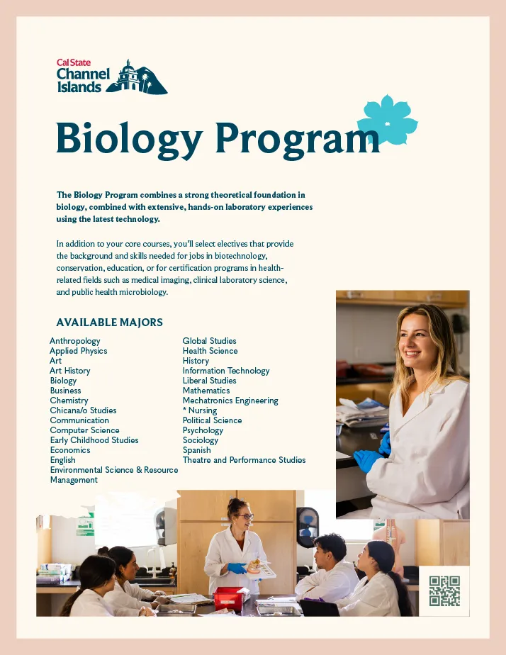 Weighted color usage in a program flyer. Content is for example only.
Along with weighted usage we want to make sure each palette is being used appropriately. To maintain a strong and cohesive brand presence, follow these guidelines when using our brand colors.
Legibility of a text color placed over a background color depends on the choice of how dark or light the background color is. A light color over a light color will not read well, but a dark color over a light color has contrast and, in most cases, will be legible.
We recommend:
Limiting use of the Neutral Accent Colors for pre-designed graphics and background colors; but do not recommend for use as text, in print or digital circumstances unless noted below (and see swatch samples on next page):
- Black, Channel Blue, or Shale for text colors on white or light backgrounds.
- For dark backgrounds, use White, Harbor Sky, or Santa Rosa Shell.
- Please refer to the WCAG chart for additional information or contact Marketing & Communications for assistance.
PRIMARY PALETTE COLORS
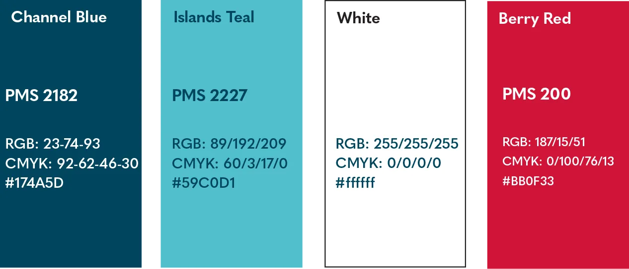
Berry Red is primarily part of approved logo applications (i.e., Cal State) and a limited legacy accent. Typical additional use is 0-5%; never more than 10%.
Do: Use primary colors as the anchoring colors in branded materials.
Don’t: Use primary colors in a way that reduces readability or creates visual strain.
Don’t: Use Islands Teal or Berry Red as a primary color base background for apparel or promotional items.
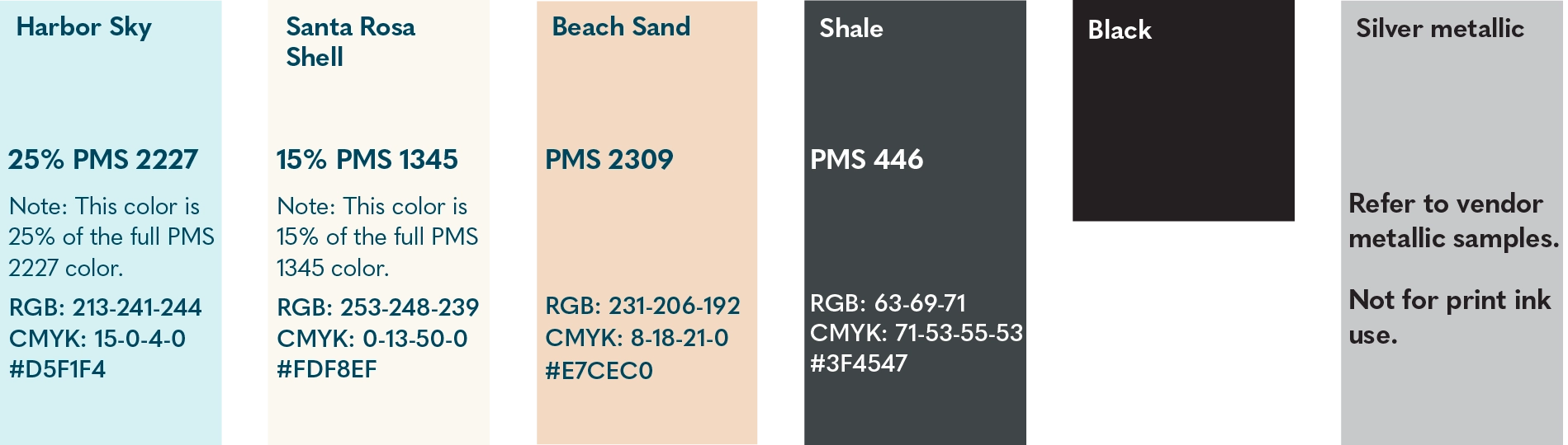
NEUTRAL ACCENT AND METALLIC COLORS
Do: Use neutral colors to create a clean and sophisticated aesthetic.
Do: Use neutral colors as background and icon colors.
Don’t: Overuse neutral colors to the point where the brand loses vibrancy and recognition.
Web Content Accessibility Guidelines (or WCAG) ensure that web content is available for audiences with disabilities. To ensure accessibility for all readers, check to see that the color of the background and foreground (text) has sufficient contrast. These contrast guidelines may also be used for non-web color design.
For more information, visit contrast-grid.eightshapes.com.
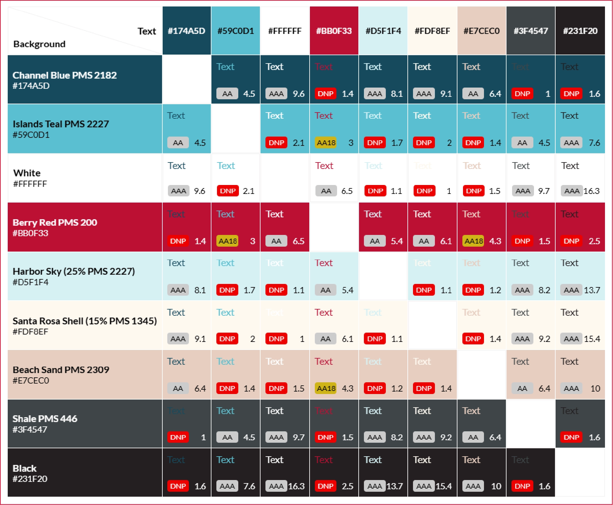
PC: For a larger view, right click on the image and open in a new tab. MAC: For a larger view, hold control and click on the image and open in a new tab.
In consideration of our Web Content Accessibility Guidelines, we have recommendations for color pairings to ensure adherence to our WCAG standards, while still staying as visually pleasing and on-brand as possible.
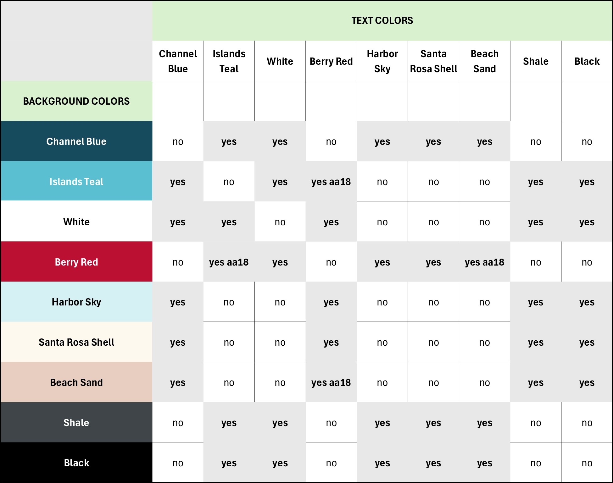 PC: For a larger view, right click on the image and open in a new tab. MAC: For a
larger view, hold control and click on the image and open in a new tab.
PC: For a larger view, right click on the image and open in a new tab. MAC: For a
larger view, hold control and click on the image and open in a new tab.
Our visual language should come to life in our environmental spaces in addition to print and digital ones. Here are some recommendations for vendor color selections specifications and brand item colors for fabrics or materials to consider that align to our brand. These are not hard-and-fast requirements and should be used to inform decisions across projects.
Consult with Marketing & Communications for confirmation of vendor color options prior to quote request and requisition entry.
STATIONERY: Vendor TBD
TABLE COVERS & RUNNERS: Proven Print, 4imprint
TENT-CANOPY REPLACEMENT TOPPERS: 4imprint
NAMETAGS/BADGES: Aswell Trophy
APPAREL
UNIVERSITY COLORS and Brands/Colors that are approved matches noted below:
(additional colors will be added to increase color options)
a. CHANNEL BLUE – Gildan/Midnight (tee); District/Caribbean Blue Heather (tee), Devon & Jones/Dark Teal (polo); L.A.T./ Oceanside (tee)
b. WHITE – all Standard White
c. SANTA ROSA SHELL – Port & Co/Natural (tee); District/Gardenia (tee/hoodie); Bella+Canvas/Vintage White (tee)
d. SHALE – District/Rainforest (tee/hoodie)
Note: ISLANDS TEAL and BERRY RED are not approved for use as background, fabric colors
EMBROIDERY THREAD COLORS
Embroidery thread colors that are approved matches to University colors are noted below: (additional colors will be added to increase color options)
a. CHANNEL BLUE - Madeira thread #1762
b. BERRY RED - Madeira thread #1147
c. ISLANDS TEAL - Marathon thread #2092
sathwiwa Mountain Line
NOTE: The sathwiwa mountain line and sathwiwa texture should only be used when the Primary logo also appears in nearby space to reinforce its shape.

sathwiwa Mountain Line Usage
Paying homage to sathwiwa, the sathwiwa mountain line element provides the necessary versatility to achieve compelling compositions. This line can act as the “channel” or connecting element between content in our compositions; see a few examples on this page.

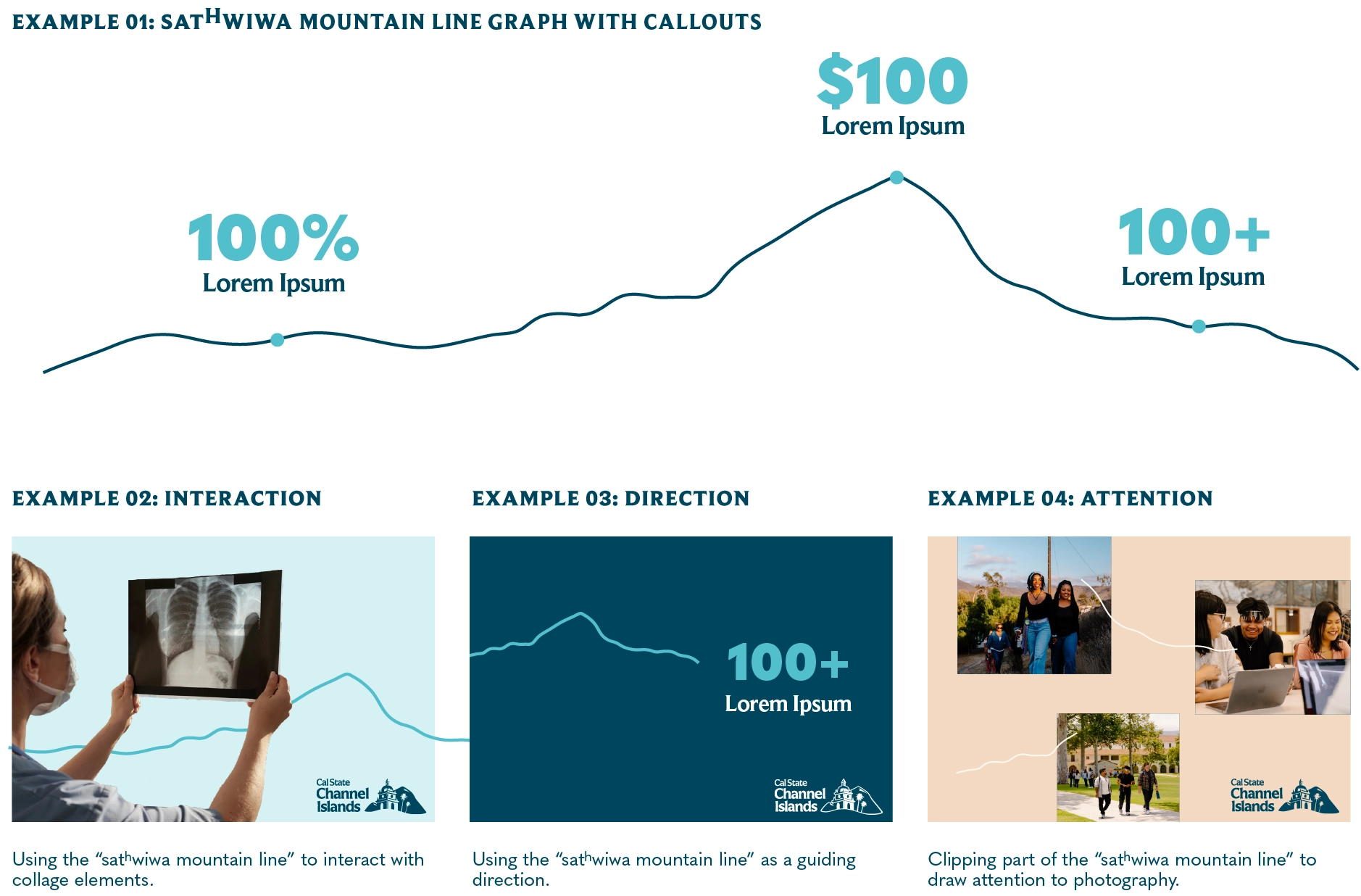 PC: For a larger view, right click on the image and open in a new tab. MAC: For a
larger view, hold control and click on the image and open in a new tab.
PC: For a larger view, right click on the image and open in a new tab. MAC: For a
larger view, hold control and click on the image and open in a new tab.
Consider the context in which you’re using this graphic element. Is there a chance it could be misconstrued by our audience for the piece? We should avoid situations where there′s a possibility this graphic can be read as a fault line, declining line graph, or other negative perceptions.
Our collage-style imagery adds depth and creativity to our design system. By layering images and clipping foregrounds and backgrounds, we can create a more dynamic and engaging story about Cal State Channel Islands.
Photos are available for use in the Marketing & Communications Flickr photo library.
LAYERED PHOTOS EXAMPLE

Additionally, Marketing & Communications will retain the current Flickr Events albums containing images from requested event coverage.
PHOTOGRAPHY STYLE EXAMPLES:
Isolated Subject, Partial Isolation, Isolated Foreground
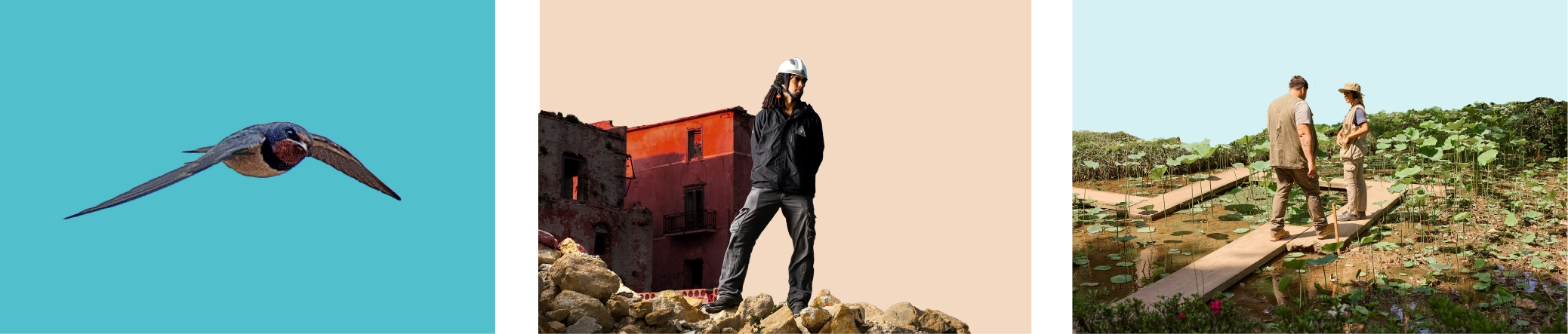
Isolated Subject: By completely removing the foreground and background, we’re able to completely isolate the subject for more focus.
Partial Isolation: By partially removing the background and keeping the foreground intact, we create more visual interest.
Isolated Foreground: By removing the background and having the foreground take up the majority of the composition we create an image that tells a deeper story.
For Social Media, the University will use images of our campus community experiences and events with minimal text on photos/images and convey messaging in the caption areas, including ADA image descriptions.
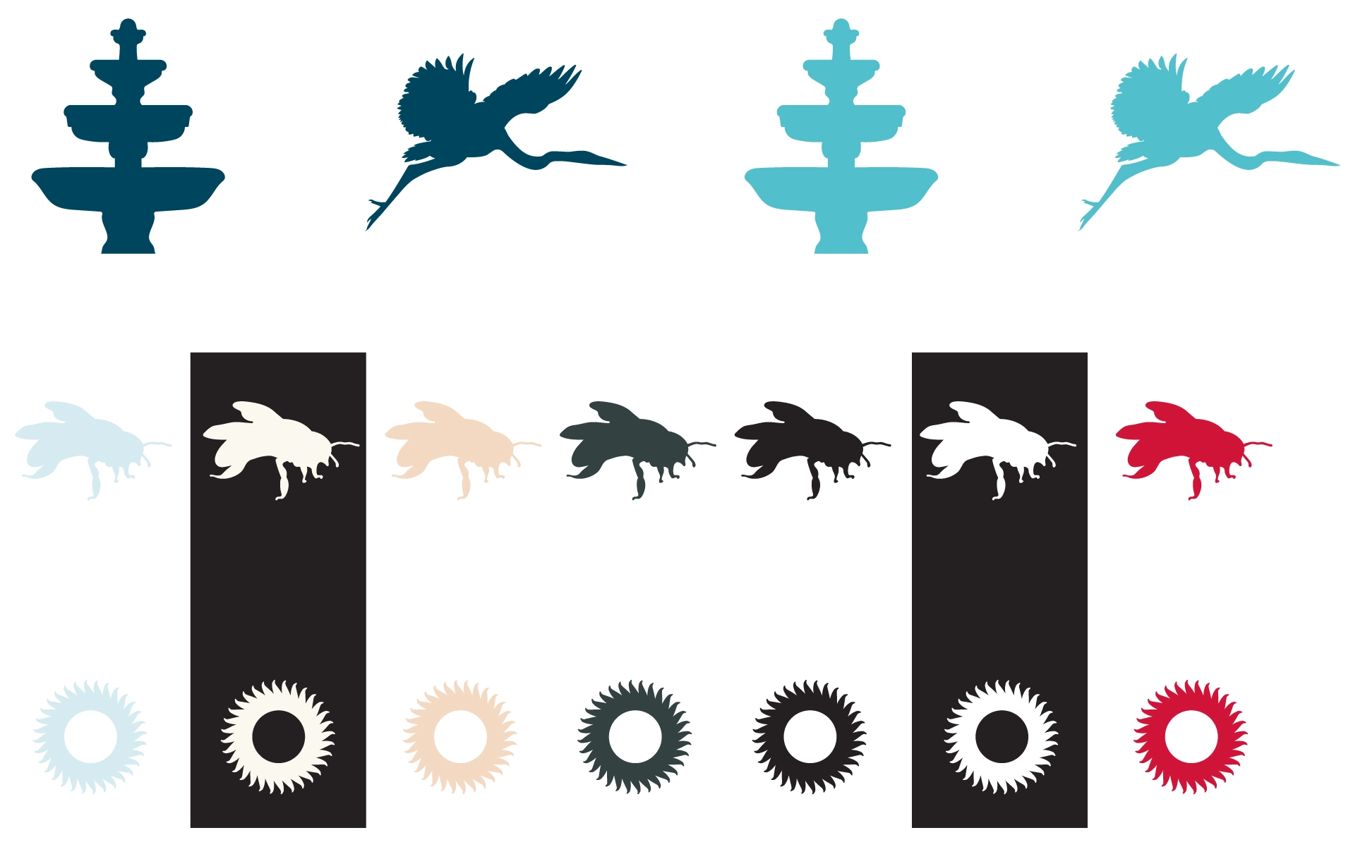
Our iconography system plays a crucial role in our design system, symbolizing our campus plants, animals, structures, or icons connected to our University. Other iconography designs will be added to these brand guidelines for future use.

Iconography Color Usage
Our sense of person is dedicated to capturing authentic, expressive, and visually compelling portraits of individuals and groups. It emphasizes emotion, personality, and storytelling to create a strong connection between the subject and the viewer.

For single-human:
Subjects should feel relaxed and natural in their environment, highlighting the subject’s personality.
Compose intentionally tight crops to show detail and authenticity through facial expressions.
Use shallow depth of field for intentional focus on the subject.
For multi-human:
Compose shots that don’t intentionally crop someone’s face; if there’s a human there, we want to see them!
Immerse yourself in the scene, but don’t interrupt the moment. Instead, observe and capture natural moments and interactions.
Our sense of environment is dedicated to capturing our surroundings. It emphasizes the atmosphere, context, and spatial elements that shape experiences and emotions. This section aims to show how we can immerse the viewer in a setting, evoking a strong sense of place and presence.
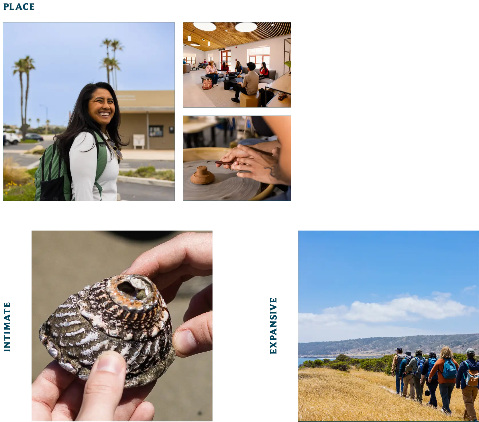
Intimate:
Close-ups of the details of our environment highlight textures and small moments, creating a sense of warmth and personal connection.
You can capture this style by using a shallow depth of field. This will keep only the foreground in focus, allowing important details to show more prominently.
Expansive:
Wide angles show the full scope of our environment, conveying the breadth of CSUCI. You can capture this style by using a deeper depth of field, so that both the foreground and background are sharp and in focus.
Our sense of doing is dedicated to capturing action-oriented, dynamic imagery that conveys movement, energy, and purpose. It emphasizes the essence of activity, whether through work, play, or daily life. This section aims to show how we create an immersive experience, drawing the viewer into the moment.

Our sense of detail is dedicated to capturing the intimate, often-overlooked elements of a subject. It emphasizes texture, subtle expressions, and the nuances that tell a deeper story. This section aims to show how we evoke emotion, curiosity, and a sense of connection through close-up and macro-style imagery.

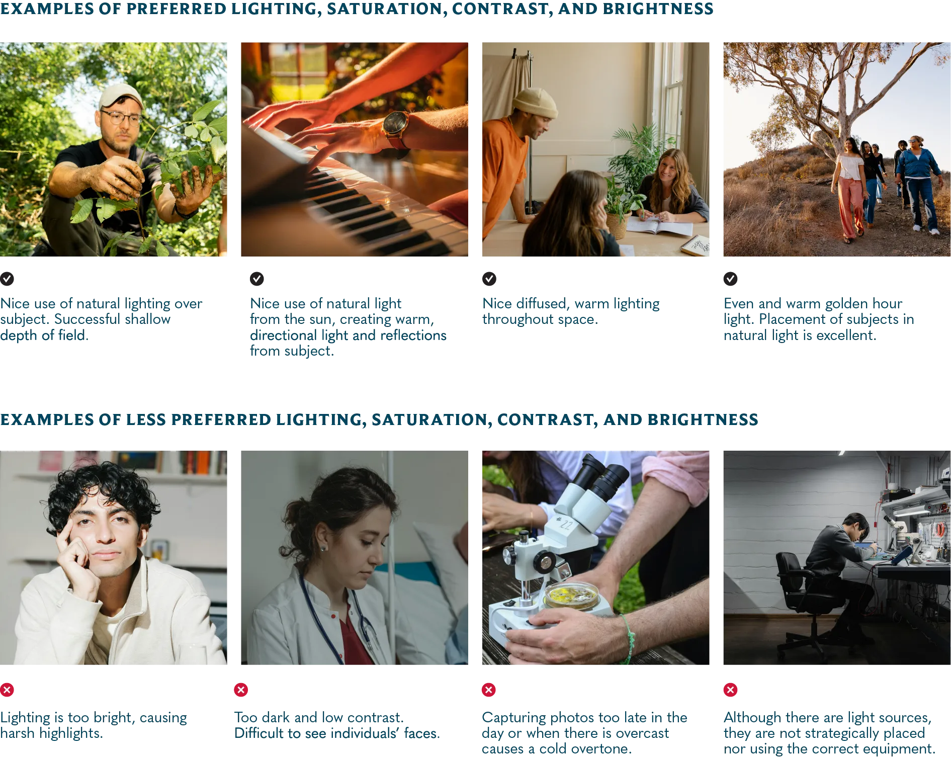
Guidance: When photographing outdoors, plan on mid-morning or afternoon to ensure a warming tone that will enhance the richness of colors in the subject.
When photographing indoors, look for spaces with windows for natural lighting.
If there are no windows and you are using artificial lighting, use a gold-toned deflector to mimic the washes of warm light that the sun would have provided.
 PC: For a larger view, right click on the image and open in a new tab. MAC: For a
larger view, hold control and click on the image and open in a new tab.
PC: For a larger view, right click on the image and open in a new tab. MAC: For a
larger view, hold control and click on the image and open in a new tab.