 March 8, 2021 — Don’t just show numbers—tell a story. That was the idea behind CSU Channel Islands (CSUCI)’s 2021 Plot-a-thon Data Visualization Festival, which was held last Friday.
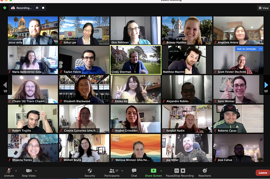
The virtual day-long event immersed students in the world of data visualization—the process of taking a mountain of raw data and compressing it into a colorful pie chart, bar chart, a word cloud, cartoons or an interactive map that appears to move and breathe as the data rolls in.
More than 31 students participated in the Plot-A-Thon along with Associate Professor and Faculty Director of the Writing Multiliteracy Center Sohui Lee Ph.D; Digital Archivist Elizabeth Blackwood; Assistant Professor of Computer Science Scott Feister, Ph.D. and Associate Professor of Marketing Ekin Pehlivan. Ph.D., who together organized the event.
“The 21st Century is the century of data,” Lee said. “If our students are to be successful in the new digital future, they need to know how to read it and they need to know how to create it.”
“We’re basically in a data gold rush right now,” Feister said.
After an introduction, the students broke into subgroups to learn about the data visualization programs Excel, Python, R program, and Tableau. Faculty from Computer Science, Environmental Science & Resource Management (ESRM), the John Spoor Broome Library, and the Writing & Multi-literacy Center ran the different workshops.
After a morning of workshops, the competing teams came together for the lunchtime keynote speeches, given by Senior Director of Business and Development for The Trade Desk and Founder and CEO of Wet Cement, Jennifer Willey, and Axios Data Visualization Journalist Michelle McGhee. McGhee explained how she creates understandable charts and data visualization graphics for reporters to help better explain their story.
“I do a mini-plot-a-thon every day,” McGhee said. “I think about the story and how to guide someone through the story with data.”
“Visualizing data is absolutely critical,” Willey said. “I’ve seen too many people make the mistake of just putting up numbers and thinking that will break through and help people care.”
Pehlivan believes understanding and working with data is a big advantage for first-time job-seekers.
“In the business world, companies are asking if our students are data literate,” Pehlivan said. “Understanding marketing data is becoming a must for potential employees.”
Plot-A-Thon competitor and Mechatronics major Emiko Ito and her team created a data visual from a massive list of reviews from Rotten Tomatoes.
“My group and I used the data to plot the worst movies rated by the Tomatometer from 1990 to 2020 using the average rating of those movies with a 49% or less,” Ito said. “We used Python to graph our points and made a 3-D graph to accurately represent it.”
Business major Jacqueline Cortes and her team used Excel to create their data visual.
“It was fun to see how we replaced a lot of data with an infographic that my team and I created,” Cortes said. “What I found to be the most challenging was I had no prior knowledge about any of this before Plot-A-Thon. I knew how to use Excel, but just the basics, but we received some help and then we realized it was easier than what we thought.”
At the end of a day, a team of three judges—two from CSUCI and one from The Trade Desk—declared that the overall winners, who each received $250, were: Kylie Godinez and Anabel Grimaldo for “A Decade In Movies.”
Winners in the other three categories received $100 a piece: They were:
Best in Excel: Britnay Haddox and Angelina Artero for “Movies over the Decades.”
Best in Python: Travis Chamness, Robert Casas and Madalyn Henderson for “Generational Genre Trends”
Best in R: Luis Salgado, Eduardo Saucedo and Joseph Miller for “Do Rotten Tomatoes Have Scoring Bias Based on Horror Film Ratings?”