Design Variations
Variations of the logo have been created to allow for more versatility while maintaining consistency in the identity.Formal Logo files available on the University network Public drive (Z) > Logos > Formal Logo folder.
Variation 1 - A and B
The Formal Logo is appropriate to use in all instances, including regional and national communications (shown below in vertical and horizontal formats). It will be used on all University publications, University stationery, policies, forms and all formal communication and collateral. The formal logo utilizes the University's colors - PMS 186 Red and Cool Grey 11 (an alternative to the Silver color).
Variation 2 - A and B
Regional
These two variations may be used in materials that focus on audiences that may already be familiar with the University and where the regionality of Channel Islands is the prominent reference. This is also the preferred option, with the flat red circle, when needing to embroider the logo on apparel.
Variation 3
International
This variation is appropriate for use in materials that have an international audience as the strength of the CSU family is at the top of the hierarchy and the identity of the region, Channel Islands, follows after. It can also be used in instances where a vertical format is appropriate due to design or space constraints, for example, University banners, business cards, or other items.
Variation 4
University Extensions
Extensions have been created for all University divisions, select areas, Schools, Institutes, Foundation entities and other select areas. This variation will also be used on University nametags.

Color Variations
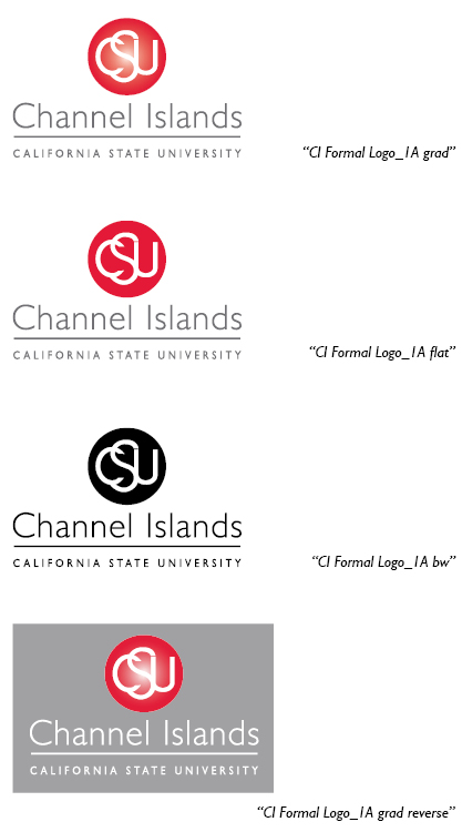
Color variations of the Formal Logo will be provided in four color types; a fifth version in all red has been approved for one-color promotional items:
- Gradient - Red to white gradient sphere with grey lettering; CSU letters in white.
- Flat - No gradient, red sphere with grey lettering; CSU letters in white.
- Black and White (BW) - Black sphere and lettering; CSU letters in white.
- Reversed Gradient - Red to white gradient sphere with white lettering; CSU letters in white.
- All PMS 186 red - Approved all red artwork, CSU letters in white. (Provided upon request)
Click on this PDF to view additional examples of color variations.(PDF, 3.36KB)
Learn more about the University's official typefaces and colors.
Size and Area
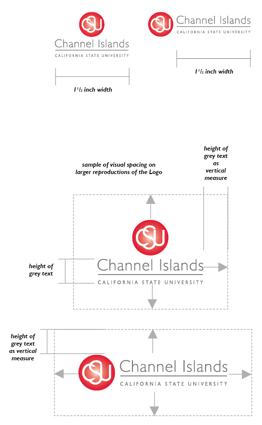
To maintain legibility, the Formal Logo text area should not be reduced to a width less than 11/2 inches.
Clear Space
It is also important to maintain an area free of other designs, patterns, and text - behind and in front of the graphic - that would detract focus from the University graphic elements. This area should be a minimum of 1/4 of an inch on all sides of any graphic elements when used at a small size. Incrementally, as the Logo size increases, so should the clear spacing around it.
A visual rule of thumb for large reproductions of the Formal Logo would be to use the height of the grey text as a guide to the size of clear space.
(The dashed box represents the clear area and is not part of the design)
Samples of Incorrect and Correct Use
Illustrated below are examples of incorrect and correct use of the University logos. Logo files should never be altered from the original format provided.
Incorrect

Correct

Why?
The typeface has been altered. Projects will be denied or told to reprint if this
error is identified. There is no reason to alter the logo in any way.
Incorrect

Correct

Why?
The complete Formal Logo must be used to properly identify the University.
INCORRECT

CORRECT

Why?
These Logos are sized disproportionately. After placing or inserting the logo in a
document, hold down the Shift key while resizing using the handles around the graphic.
INCORRECT

CORRECT

Why?
All versions of the Formal Logo should have white CSU letters in the red ball when
appearing over a dark or patterned background. The only exception would be when using
an all-white logo on apparel. Versions of these all-white logos may be obtained by
emailing joanna.murphy@csuci.edu.
INCORRECT

CORRECT

Why?
The text appears too close to the Logo. Maintain a minimum of 1/4 of an inch of clear
space on all sides of the Logo, increasing incrementally as the Logo becomes larger.
Information regarding clear space can be found on each logo page.
INCORRECT

CORRECT

